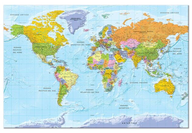
Who has not seen a map similar to the one shown below?
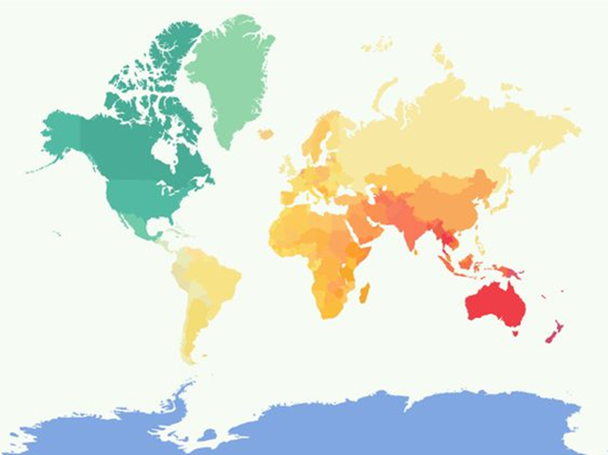
World map with Greenland in light green, northeast of Canada
This is a map made using the Mercator projection. Gerardo Mercator was a geographer and mathematician from the 16th century, who devised this cartographic projection to create maps of the earth’s surface. But how can you represent a spherical surface (such as the Earth’s surface) on a sheet of paper? You can, but you have to pay a price: the areas will get bigger as you get closer to the poles. Greenland is the perfect example; on the world map it appears to be larger than South America, however it is smaller than Argentina. Greenland’s area is 836,300 square miles, while Argentina’s is 1,073,500 square miles.
We can get a better idea of the relative size of these two regions with the help of the following drawings:
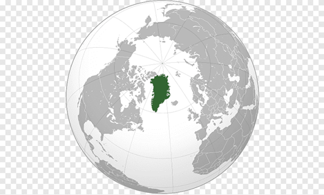
Greenland in green
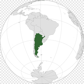
Argentina in green
As we can see, Greenland was much smaller than we thought. The same can be said for the northernmost parts of Canada and Russia, and Antarctica.
REFERENCES: The data has been taken from the internet.